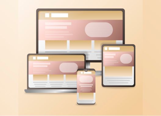
Responsive to all screens
At Pland, every page is automatically adapted to the width of the screen on which it is displayed
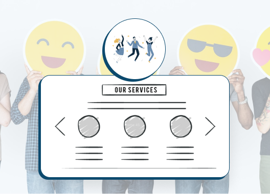
We have created a diverse library of components for your site and landing pages, such as customer recommendations, contact details and map, features and services, which automatically adapt themselves to screens. This is so you don't have to work hard, Google will rank you high, and your visitors will receive an optimal experience.
“I started receiving so many leads... Finally, I have a website that looks good! It's really easy to build it - 5 minutes is the truth”

Mor
Founder of 'Professional Courage' Course
No need to work twice
In most website and landing page building systems, you need to design 2-3 versions of the site for smartphones, tablets, and computers, which requires knowledge in design and layouts, and unnecessarily consumes time. With Pland, you build only one version, and every page automatically adjusts itself to any screen size. Magic!
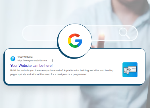
High SEO score
Google's algorithm lowers the score of websites and landing pages that are not correctly adapted to different screen widths. At Pland, all pages and sites are automatically adapted, which is one of the reasons why they receive a perfect 100% score from Google in the PageSpeed test.
Better user experience
When every visitor to your site (a potential customer) receives the version of your site that is adapted to their device and screen, their experience becomes more positive, increasing the likelihood of them ordering a product or service from you or even leaving their details.
Build your website easily and quickly
Start building your dream website for free. All you need is to register and start working.